Spending more time at home this year has inspired many to roll with it and address spaces that no longer felt meaningful. In Life is Good: The Book by Bert and John Jacobs (the founders of the Life is Good brand), it’s suggested everyone ‘minds their space,’ whether it’s home, office, home office, tight quarters or open-floor. The entrepreneurial brothers believe “your physical space is also your mind space” and why not take “a few fresh chances?” It’s a no-brainer that safe colours are synonymous with beige, but “beige surroundings can foster beige feelings and ideas. Who wouldn’t cancel a full day with beige to go to a meeting with green, or a party with yellow?”
Even though we’ve cruised through the midway point of 2021, it’s not too late to capitalize on the colours of the year, as the mood they invoke is inspired and comforting—we’ll introduce some ideas to help brush up your painting resume, too!
 85vw, (max-width: 909px) 67vw, (max-width: 1362px) 62vw, 840px” data-recalc-dims=”1″ style=”max-width: 100%; width: 857.609px;” /><figcaption id=) Image via Pantone
Image via PantoneFinding your palate’s palette
PANTONE chose Ultimate Gray and Illuminating (a cheerful yellow) in a daring bi-colour move for 2021. The company wanted to demonstrate the supportive nature of two colours that convey strength and positivity. It’s no surprise communicating hope and the feeling “everything is going to get brighter” was paramount, in paint.
BEHR® opted for an “earthy and harmonious” Canyon Dusk for this banner year and a palette of 21 colours to “elevate your comfort zone.” We’re talking Seaside Villa, Kalahari Sunset, Saffron Strands, and Jean Jacket Blue. Benjamin Moore was in sync with BEHR®, singing in harmony with Aegean Teal and a palette of a dozen colours that “radiate warmth and wellbeing.
 85vw, (max-width: 909px) 67vw, (max-width: 1362px) 62vw, 840px” data-recalc-dims=”1″ style=”max-width: 100%; width: 857.609px;” /><figcaption id=) Image via Flickr, @JohnColey
Image via Flickr, @JohnColeyThe fifth wall
This year, the trends are looking up—way up! Painted ceilings! The “fifth wall” is finally getting attention, cozying up reading rooms with darker tones or mimicking sunny skies with shades of blue is an unexpected twist from the norm.
Watching Celebrity IOU episodes like the one featuring Gwyneth Paltrow and her assistant’s dramatic Roman clay finish powder room provides inspiration beyond standard wall painting. Colourful wall panelling is gaining ground too, especially in primary bathrooms with soaker tubs.
It’s easy to visually define a space with colour and some cool, versatile techniques—it’s an IOU DIY you owe yourself.

Colour blocking
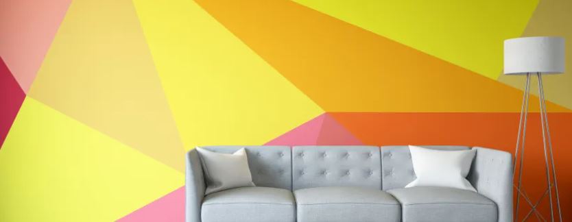
For the indecisive, colour blocking a room or wall can be a whimsical way to combine two colours in one space. White or another neutral colour is often paired with a significantly brighter or darker tone for contrast. Split your wall in half with painter’s tape to create a definitive straight edge or skip the tape for a blurred look (for the imperfectionists). There are few rules—you can colour block a wall and then extend the same colour to the ceiling. Paint a partial area (to create a nook) or the entire ceiling. A more cautious attempt can be applied to a focal door using the half and half approach or a diagonal design.
 85vw, (max-width: 909px) 67vw, (max-width: 1362px) 62vw, 840px” data-recalc-dims=”1″ style=”max-width: 100%; width: 857.609px;” /><figcaption id=) Image via Max Vakhtbovych from Pexels
Image via Max Vakhtbovych from PexelsYou can also play with geometric patterns, triangles or rectangles (again, relying on high quality painter’s tape). Overlapping ovals or arches will require a confident free hand to create or the use of stencils or a template (that can be traced) made out of cardstock.
Depending on your colour choices, you may need to apply two or three coats. Make sure the paint is totally dry before removing the tape!
 85vw, (max-width: 909px) 67vw, (max-width: 1362px) 62vw, 840px” data-recalc-dims=”1″ style=”max-width: 100%; width: 857.609px;” /><figcaption id=) Image via Flickr @photoMiki
Image via Flickr @photoMikiConcrete plans
If you want to lean hard into the industrial look without the warehouse space, this simple paint project will enable you to achieve a finished product resembling concrete. A product like LOFT Raw Concrete is an easy-to-apply water-based interior wall coating. The ‘secret paste’ is mixed with a powder containing slack lime that’s diluted and added to the wall to create the nuances and depth of concrete. A stainless-steel float will help polish and smooth the surface (in a Karate Kid “wax on, wax off” motion).
 85vw, (max-width: 909px) 67vw, (max-width: 1362px) 62vw, 840px” data-recalc-dims=”1″ style=”max-width: 100%; width: 857.609px;” /><figcaption id=) Image via Flickr, @Danielle_Blue
Image via Flickr, @Danielle_BlueVenetian vs. schmear
For an elegant approach to a primary bedroom or stairway, Venetian plaster is a timeless technique using a nap roller, trowel, and tinted Venetian plaster. While the roller quickly applies the plaster, a trowel is necessary for levelling. Before you begin, experiment on a sample board and be patient. The plaster must dry a minimum of four hours before the second coat is applied.
A German schmear application on decorative faux brick wall panels will achieve an instant century-old, historical presence with some drywall compound, a liberal “mortar wash,” and paint. This look is ideal for powder rooms, teen bedrooms or pantries for an urban coffee haus feel.
Both treatments are forgiving and a clever way to cover up imperfections in the wall.

If you’re really ready to let your hair down and boldly go where few dare, here are a few accent wall ideas to pack some wow into your space. Not sure where to start? Here’s a quiz that will pinpoint the paint colour that matches your personality. It’s time for a few fresh chances, don’t you think?
