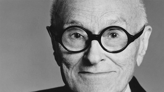
Philip Johnson was born in 1906 in Cleveland Ohio. He died in 2005. He was known for his modern style architecture including the glass house and his postmodern style such as 550 Madison as well as 190 South La Salle Street. He was awarded the American Institute of Architects Gold Medal as well as the Pritzker Architecture Prize. In 1928 he met Ludwig Mies van der Rohe from which was forged a lifelong relationship and collaboration. His Modernist Period was from 1949-79. Subsequent to that came his Postmodern Period 1980-1990.
Modern – Known for its use of glass, steel and reinforced concrete. It rejected the past traditional neoclassical architecture and Beaux-arts.
Postmodern architecture – came during the 60s in reaction to the simplicity of the modern architecture.
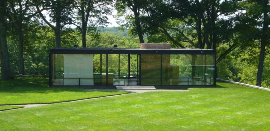
Glass House, New Canaan, Connecticut, 1949
Inspired by Mies van der Rohe’s Farnsworth House the Glass House is considered to have perfect proportions and is seen as one of the modern style classics. In 1997 it was declared a National Historic Landmark.
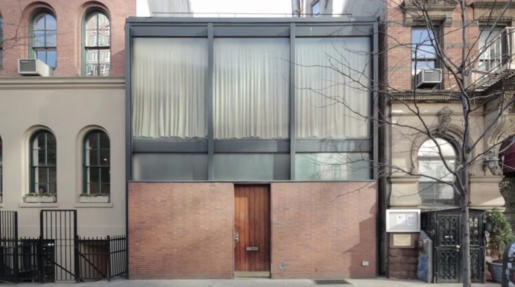
Rockefeller Guest House, Manhattan, New York, 1950
This home was built as a guest house for the Rockefeller’s. Johnson himself lived there for a period of time. I love the Barcelona sofa in the living room, perhaps a gift from Mies. The water feature in the middle is stunning. Molly thinks it should have been at least 3 storeys like it’s neighbours. What do you think?
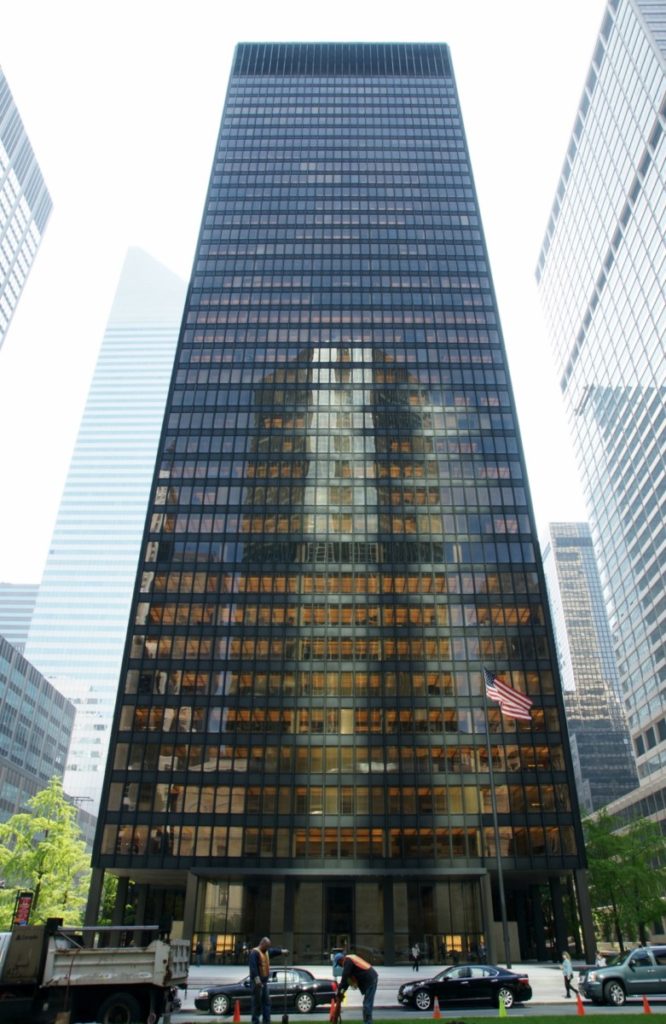
Seagram Building – Interior, Manhattan, New York, 1958
The Seagram Building would be the quintesential modern building. You may not like it but its simplicity was the necessary step to take us from a more ornate period to where we are now.
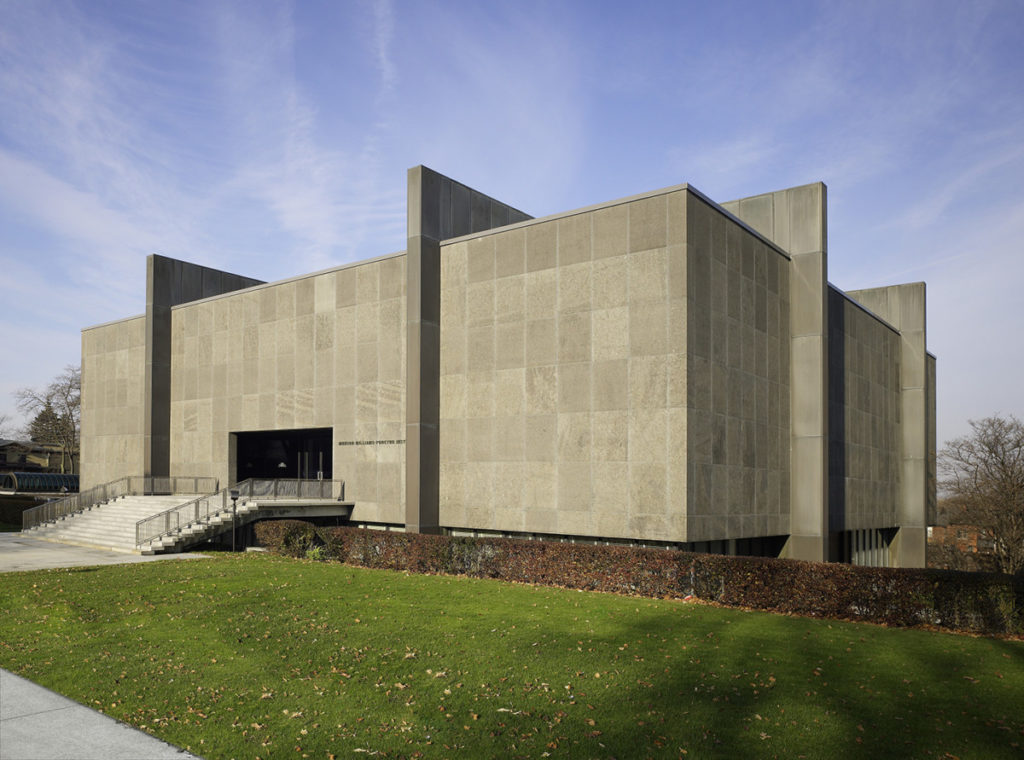
Munson-Williams-Proctor Arts Institute, Utica, New York, 1960
Marking the end of Johnson’s loyalty to the International Style and his turn towards Neo-Classicism, this stunning sculpture like museum is wrapped in dark grey Canadian granite seemingly held together by bronze buttress like supports.
Utica, New York
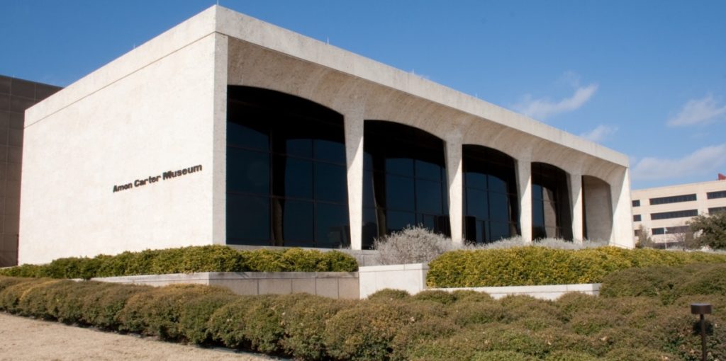
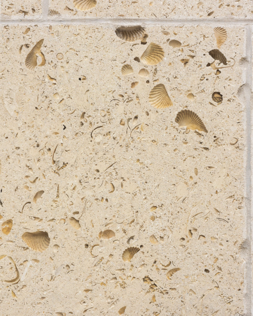
Amon Carter Museum of American Art, Fort Worth, Texas, 1961
The facade is creamy Texas shellstone, the three other sides are shellstone cladding.
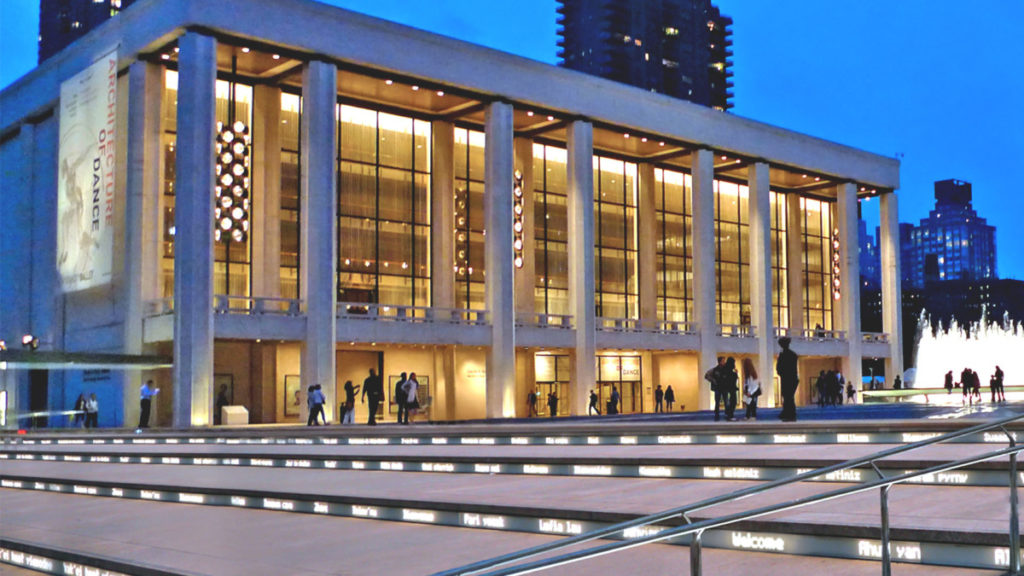
David H. Koch Theatre, Manhattan, New York, 1964
Initially built for the 1964-65 Word Fair the ownership was subsequently transferred to the City of New York. You will remember that the firm of Dillier Scofidio + Renfro was responsible for renovations in 2008
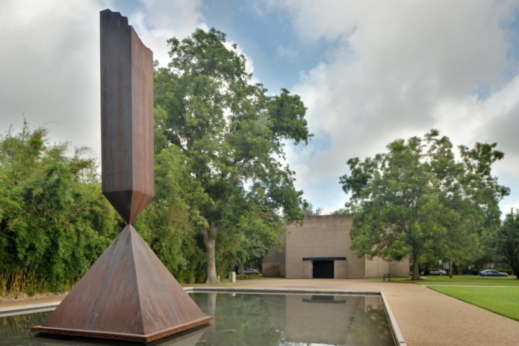
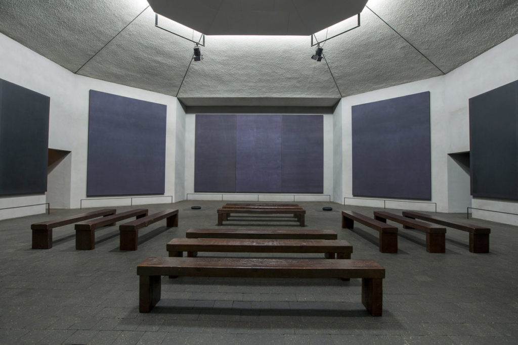
Rothko Chapel, Houston, Texas, 1971
With Barnett Newman Obelist (think Voice of Fire (which I love but is a WHOLE other conversation)). The interior serves not only as a chapel but as a major work of modern art with fourteen black canvases by Mark Rothko (yes one of his paintings lives next to the Voice of Fire)
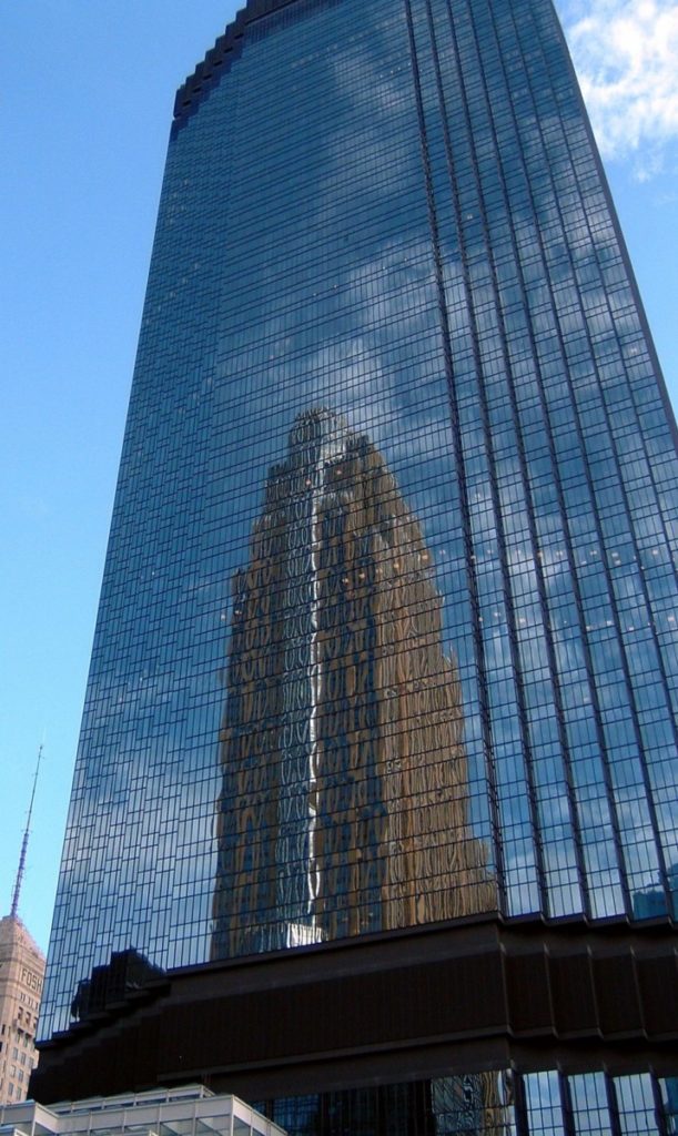
IDS Centre, Minneapolis, Minnesota, 1972
At 10,900m the IDS centre is the tallest building in the state. Thanks to the stepback design of the building, Johnson referred to these as zogs each floor has 32 corner offices.
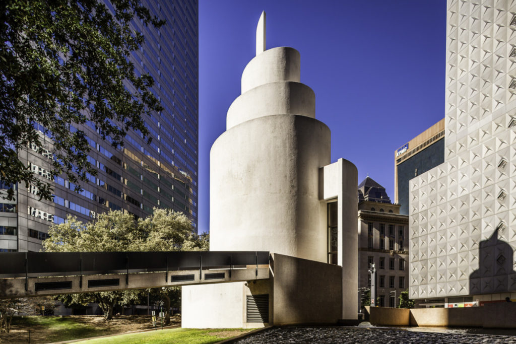
Thanks-Giving Square, Dallas, Texas, 1976
In spite of, and perhaps because of it’s dark moment in history Dallas built this place for peace and reflection for people of all backgrounds.
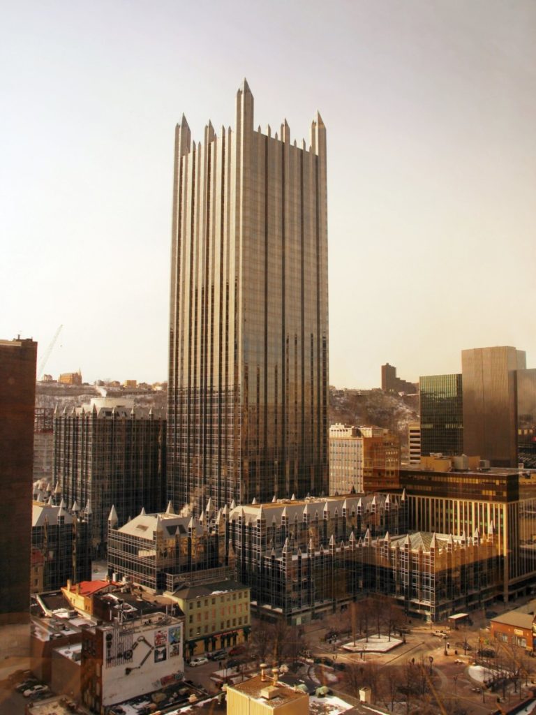
PPG Place, Pittsburgh, Pennsylvania, 1984
The crown jewel of the Pittsburgh skyline. This 40 storey building is clad with approximately one million square feet of glass. Its design is both modern and neo-gothic.
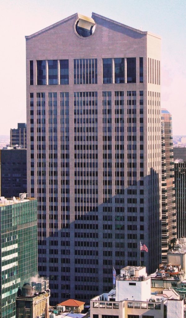
Sony Tower, 550 Madison Avenue, Manhattan, New York, 1984
Built in 1984 plans are currently underway to perform some renovations. Changes are being proposed at the lower levels. A number of petitions have been submitted: Thankfully! I find it sad that sometimes buildings undergo a period of time where they are less popular, less desirable. They have to survive that period of time before once again being appreciated. Think of Place Bell on Elgin Street. I always thought that was a great building. At one point a two storey brown granite front was added which looked ridiculous and would make me cross everytime I’d drive by. Now, that has been taken down and is being replaced with a curved glass structure: really! In the past the 14 columns inter spaced with glass rose from the ground and went straight up – to me it was a much more cohesive design. We should get Bill Teron’s opinion!
And so I can understand the New Yorkers concern for this iconic builging and their wish to have it designated.
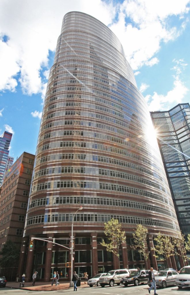
Lipstick Building Manhattan, New York, 1986
Nicknamed for it’s resemblance of an open lipstick tube. It’s colour emphasizing the look of the cosmetic.
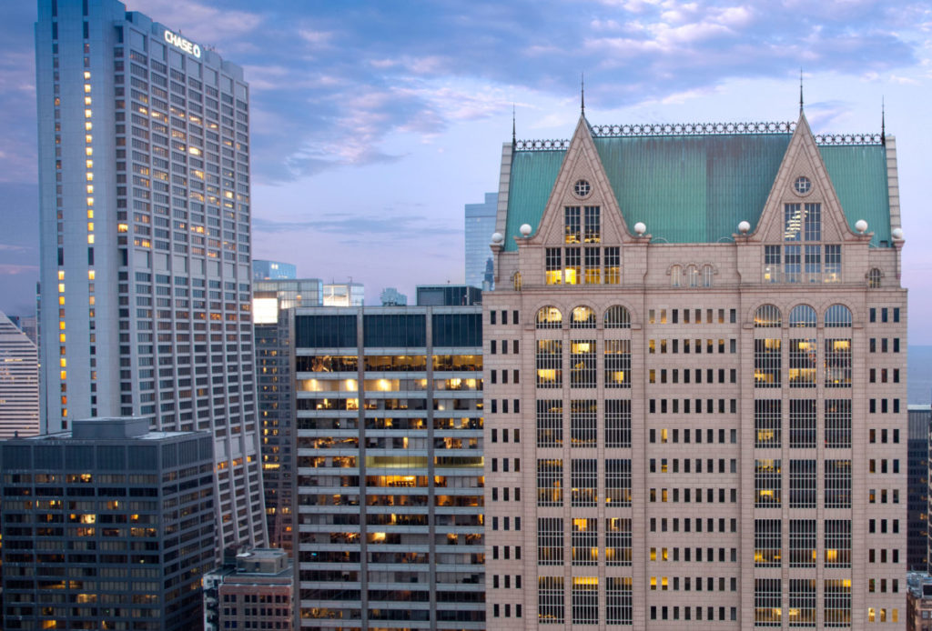
US Bank Building, 190 South LaSalle Street, Chicago Illinois, 1987
Designed to blend with it’s neighbours at street level the beauty of it’s design happens roof-top. It is in Chicago with the Chicago Architecture Foundation that I learnt the expression “dialogue” when referring to architecture. They would explain that a new building was designed with elements of a neighbouring building in mind either complementing or contrasting with a particular feature. Note the Chateauesque detail.
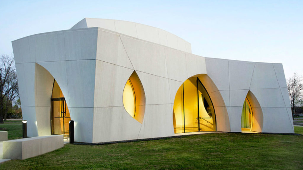
Interfaith Peace Chapel, Dallas, Texas, 1990
A serene and sacred space. The chapel purposefully resembles none thus emphasizing its lack of denomination.
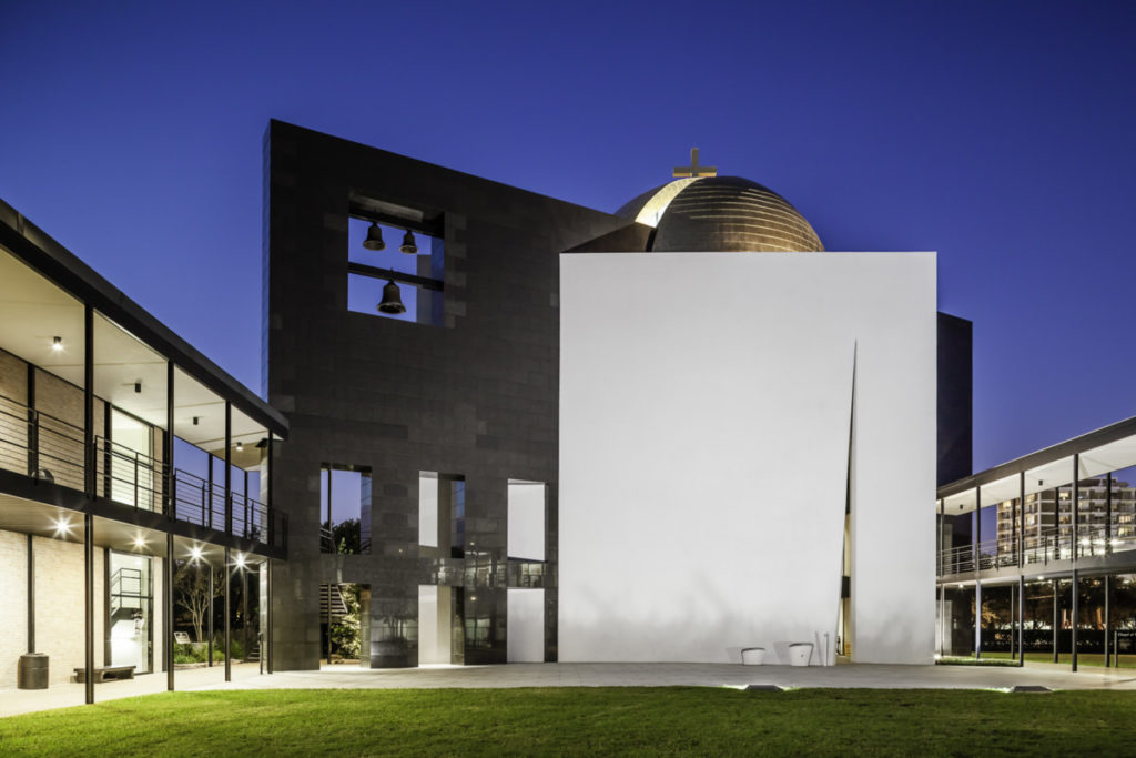
Chapel of St. Basil, Houston, Texas, 1997
Placed at the end of a corridor of academic buildings facing one another, the Chapel of St. Basil is jarring in contrast . It is composed of three geometric shapes, the cube, the sphere and the plane.
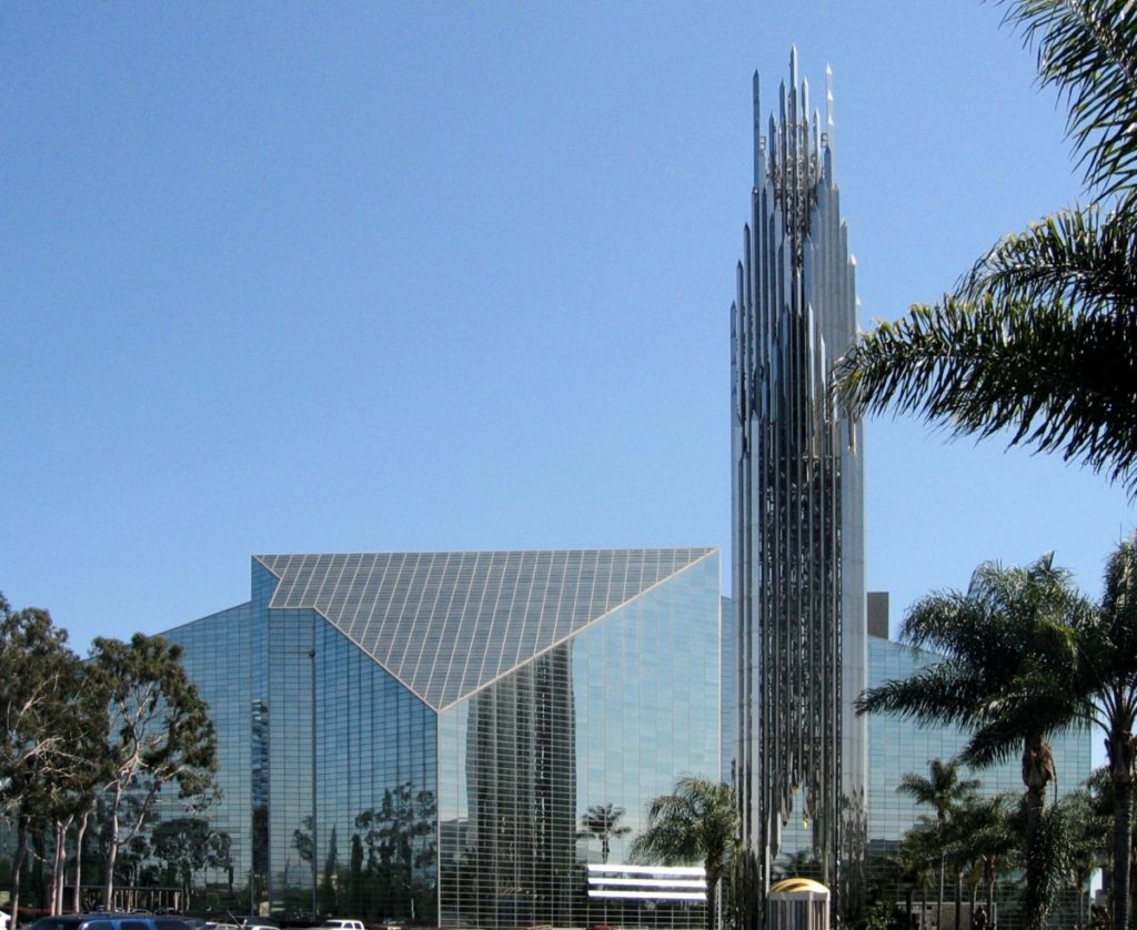
Crystal Cathedral, Gargen Grove, California, 2007
Designed for a congregation of 3000 but ultimately, it’s glass panels are held in place in a manner as to create as little obstruction as possible with it’s surrounding.

[…] House Butterfly Roof Retro Camper Midcentury Modern / Cliff May Glass House / Philip Johnson Midcentury Modern with butterfly room and Iconic furniture including Eames lounge chair, […]