In this second instalment of Brutalist architecture we take a tour of downtown Ottawa with Sarah Gelbard. Let us continue to broaden our minds and continue to explore architecture which unlike the Victorian style was popular in the 70s. This tour organized by Heritage Ottawa was led by Sarah Gelbard, Ph.D. candidate, Urban Planning, McGill University and editor of Spacing Ottawa.
My pictures could be a bit better but when you’re with a group both listening and pointing the camera around it stiffles your creativity – that`s my line and I`m sticking to it.
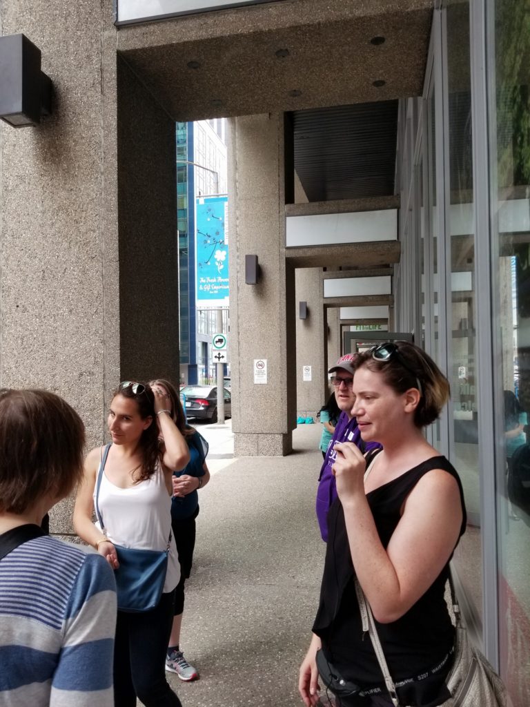
National Art Centre
Fred Lebensold
1967
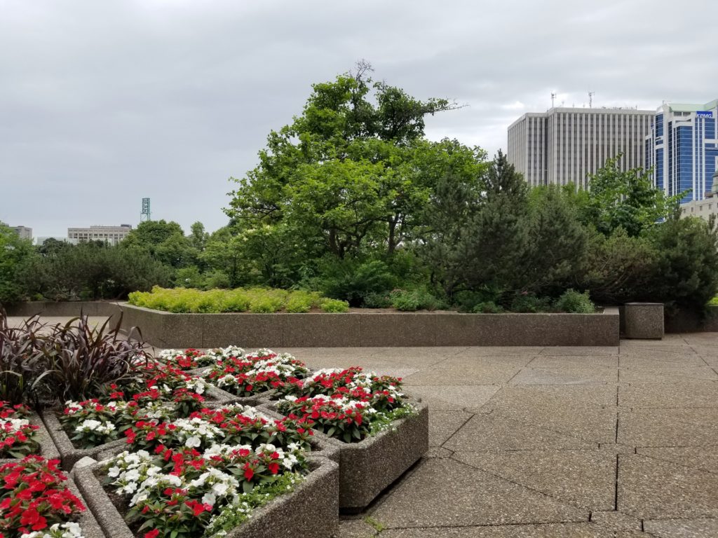
We mostly spent out time exploring the terraces. Terraces which thanks to the addition no longer have the flow they used to. I must say I like the addition lit up in the evening but during the daytime I’m not a huge fan of the finish sidewalk-level.
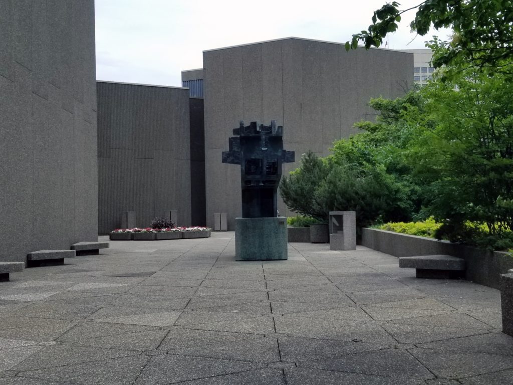
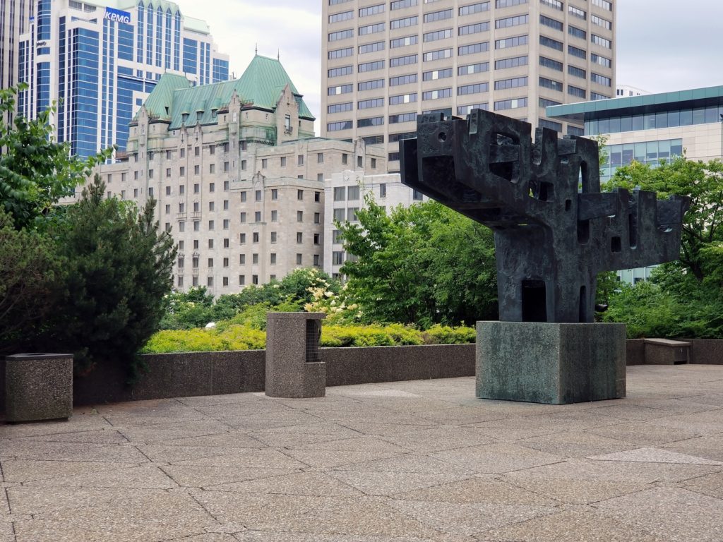
Sculpture by Charles Daudelin
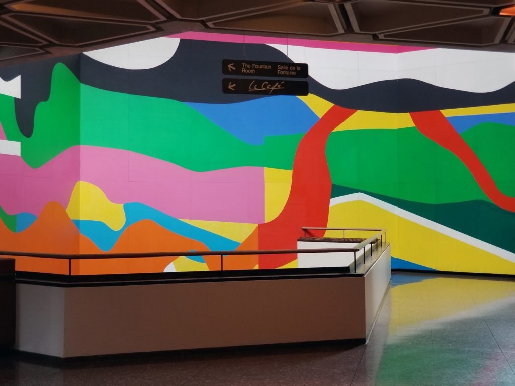
I do like this mural!
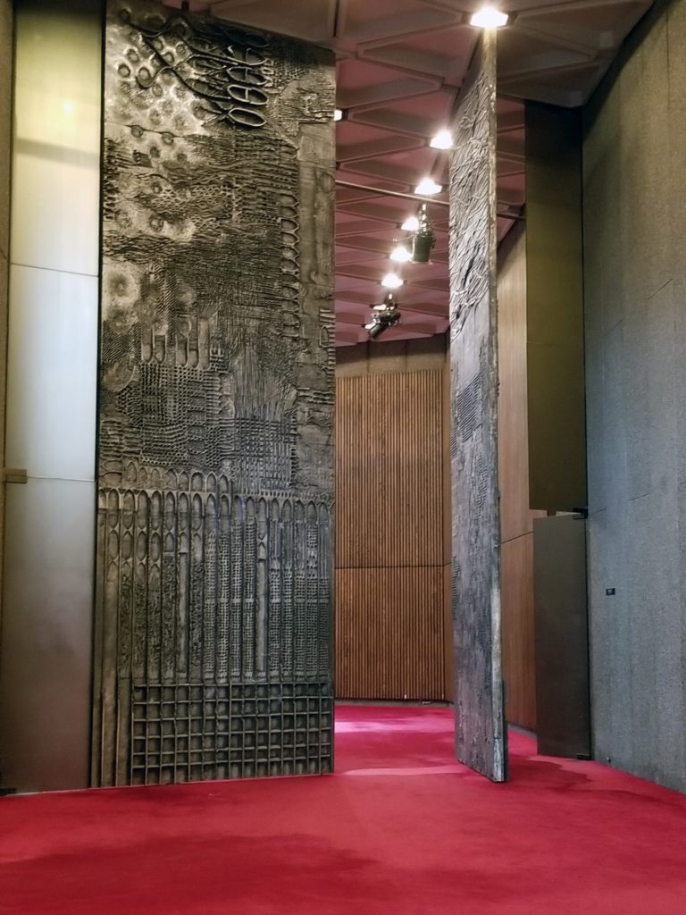
You may or may not like the subject of this post but these doors in the National Art Centre are amazing.
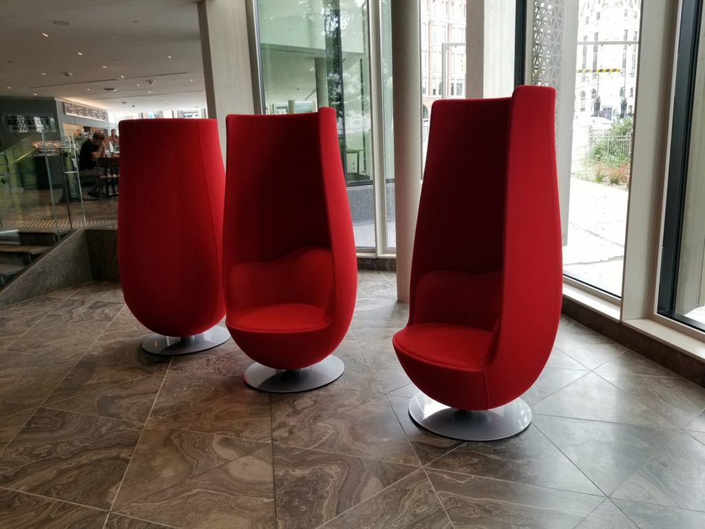
Some of you know I have a thing for chairs. This is Wander`s Tulip Chair 3d model.
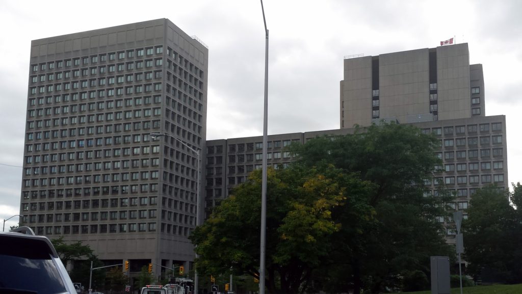
Major General George R Pearkes Building
Architects John C. Parkin, Searle, Wilby, and Rowland
1974
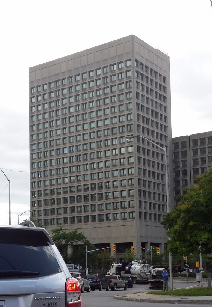
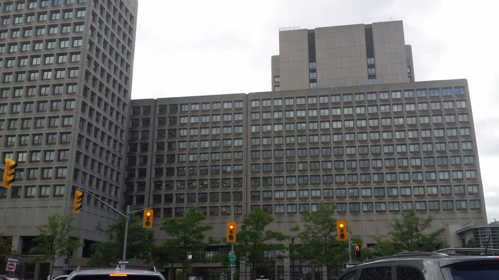
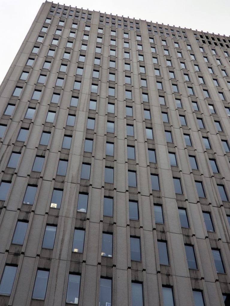
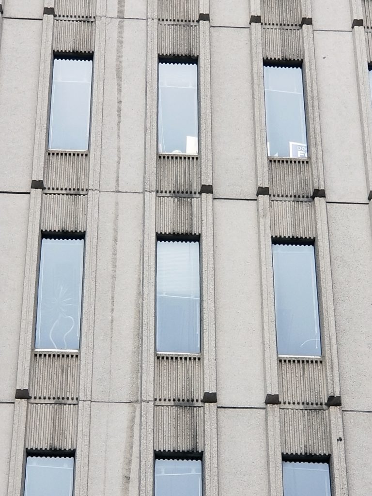
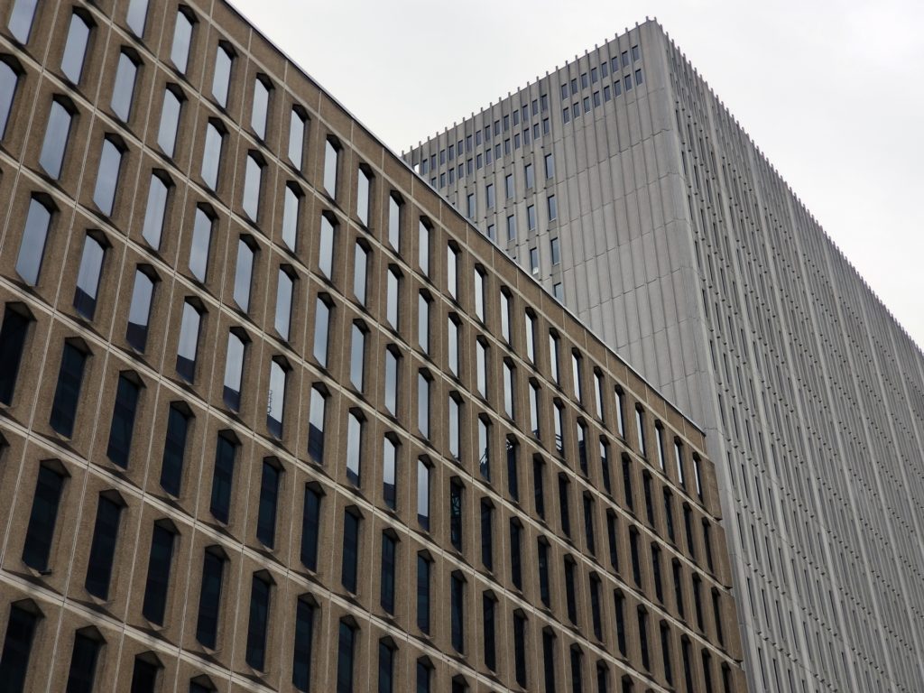
Varette Building
130 Albert Street
1970
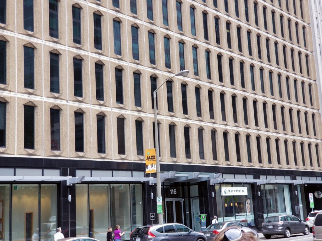
Royal Trust Building
116 Albert Street
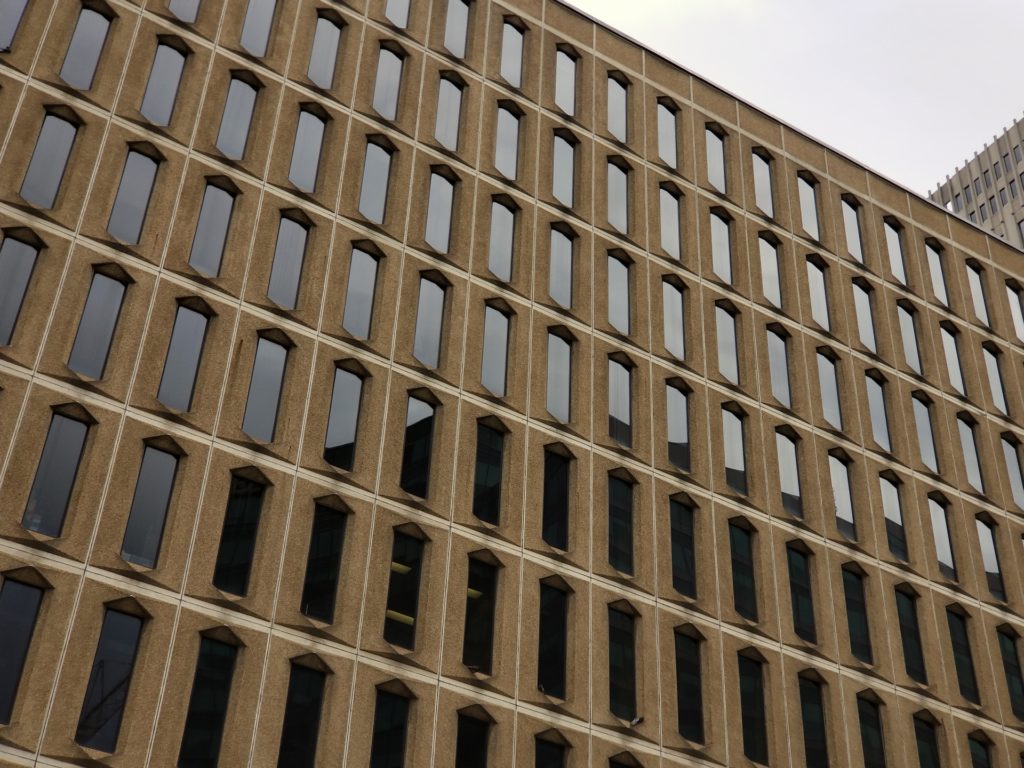
110 O’Connor Street
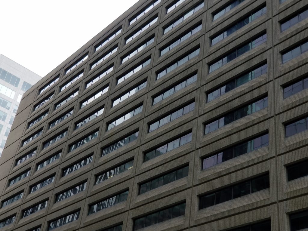
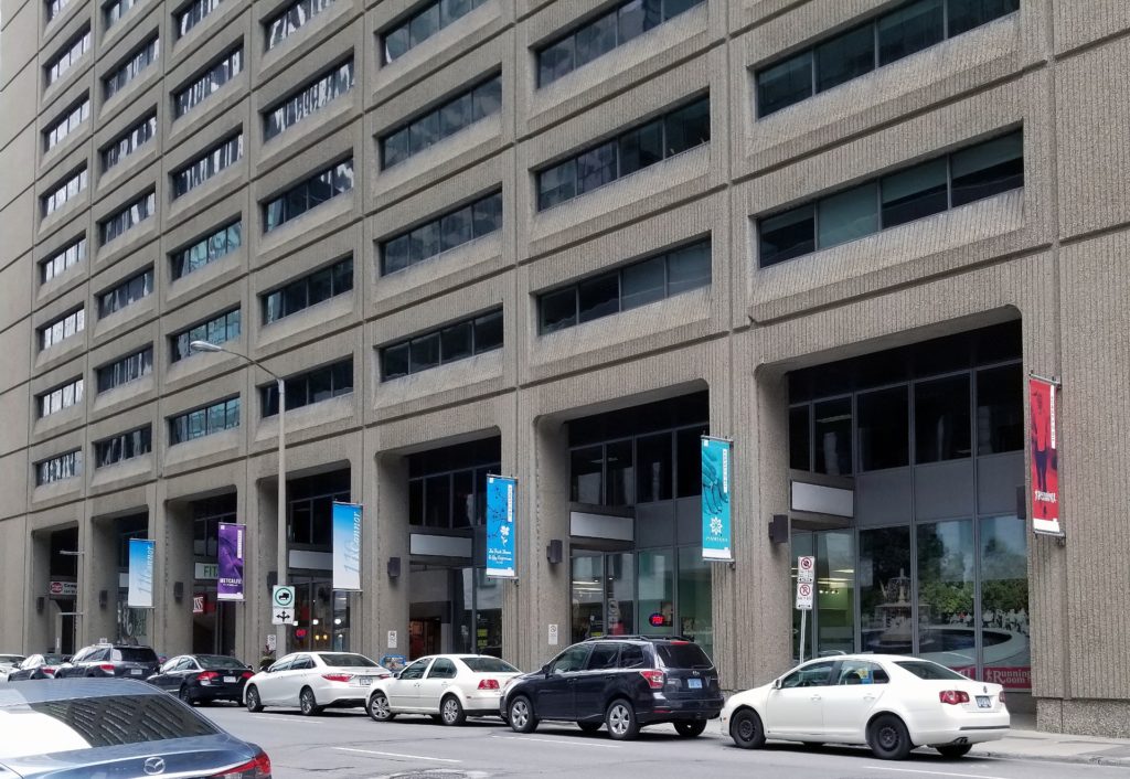
Vanguard Building
171 Slater Street
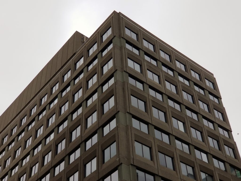
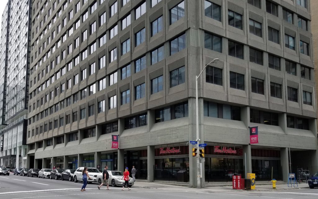
Burnside Building
171 Slater Street
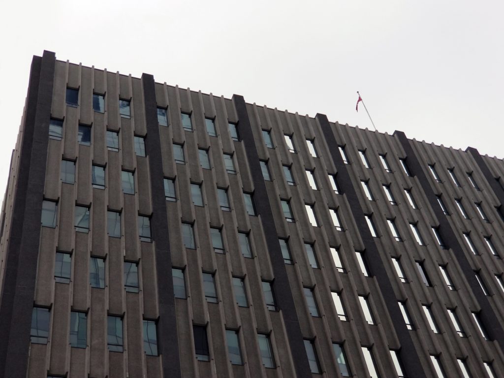
220 Laurier Avenue West
G.E. Bemi Architect
1974
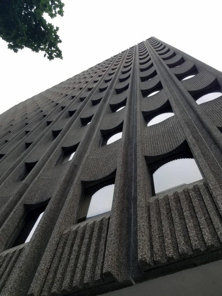
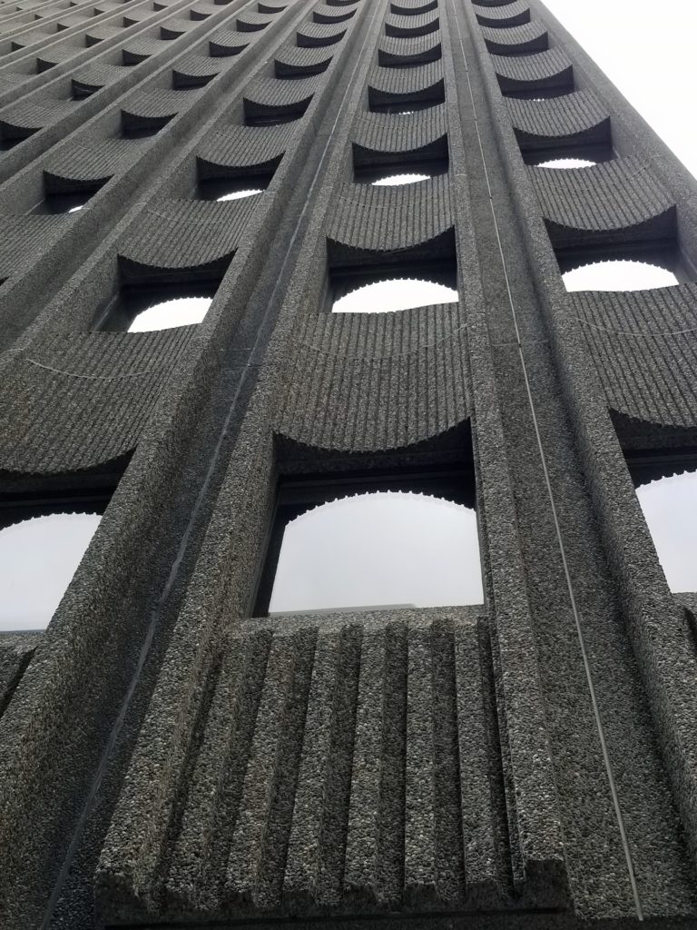
Sir Richard Scott Building
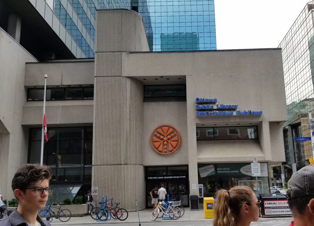
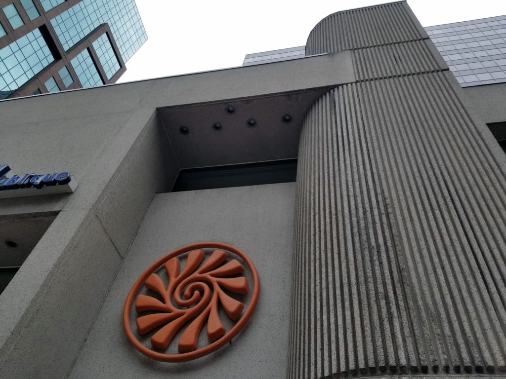
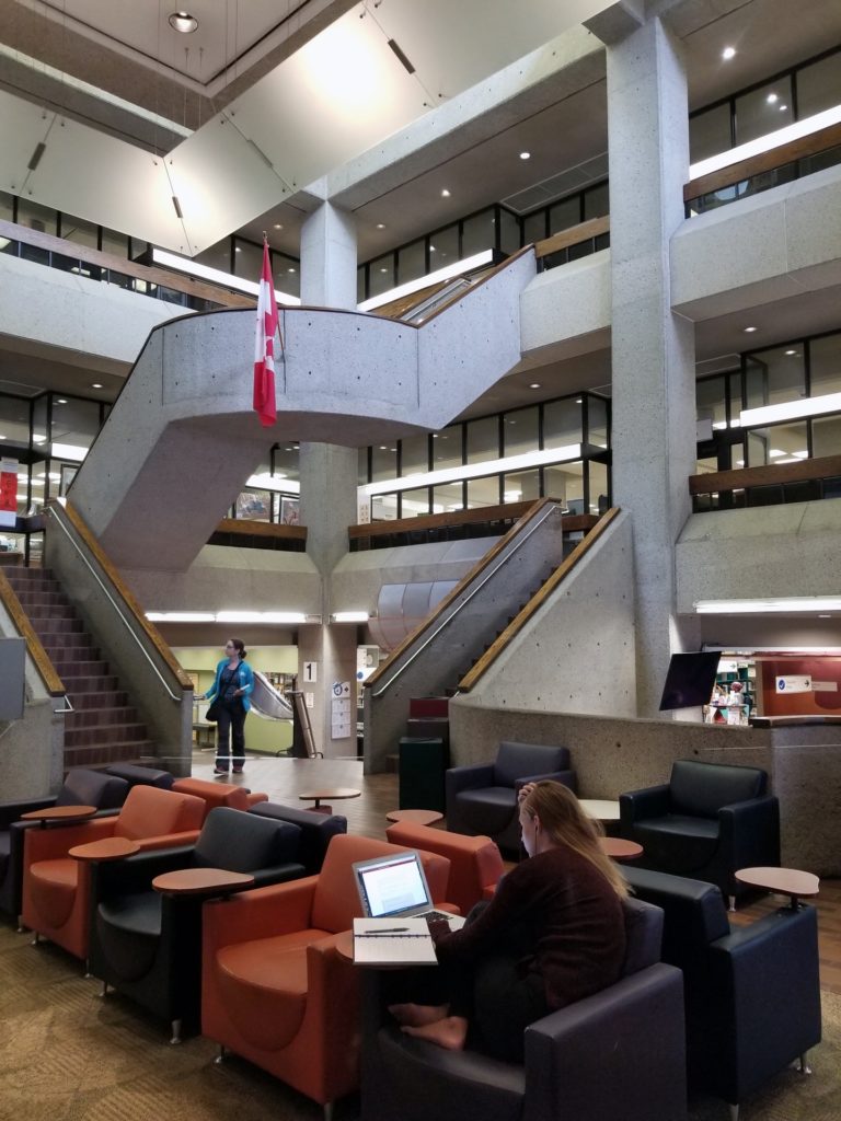
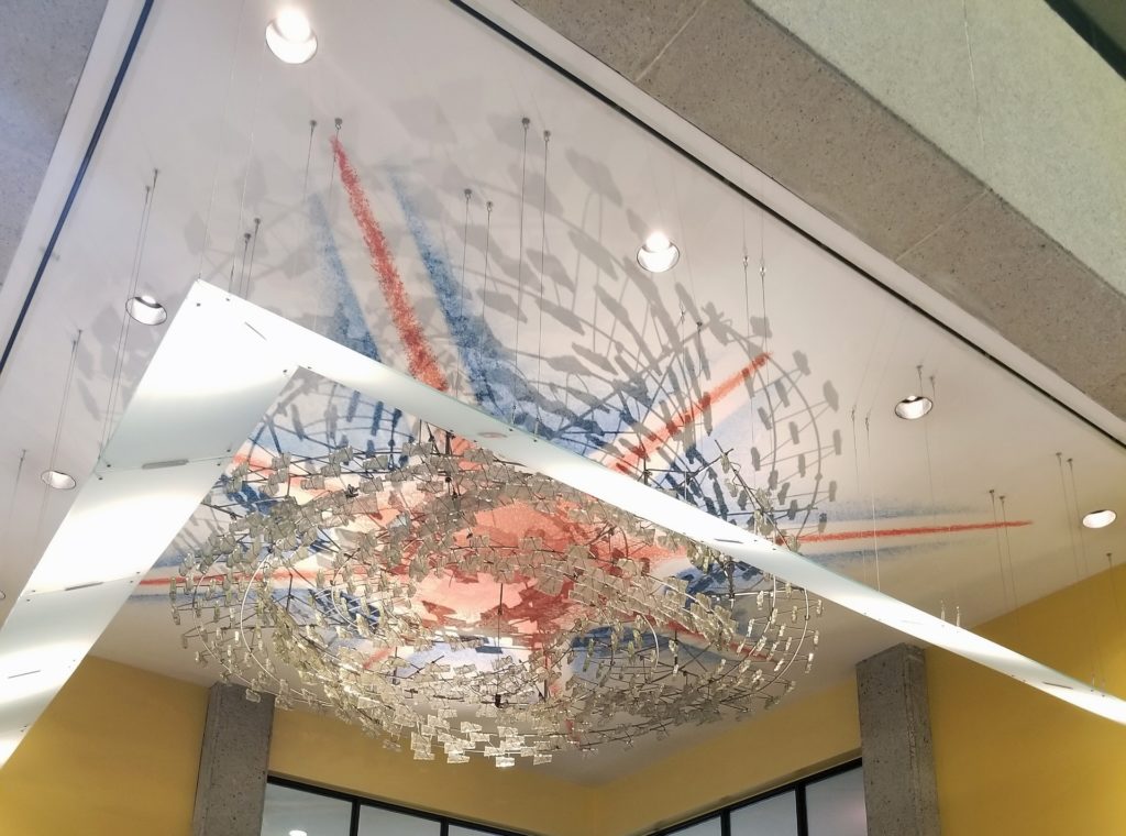
Ottawa Public Libary
Main Branch
George E. Bemi
1973
I think this sculptural building is great. I understand some dislike it. What’s not to like?
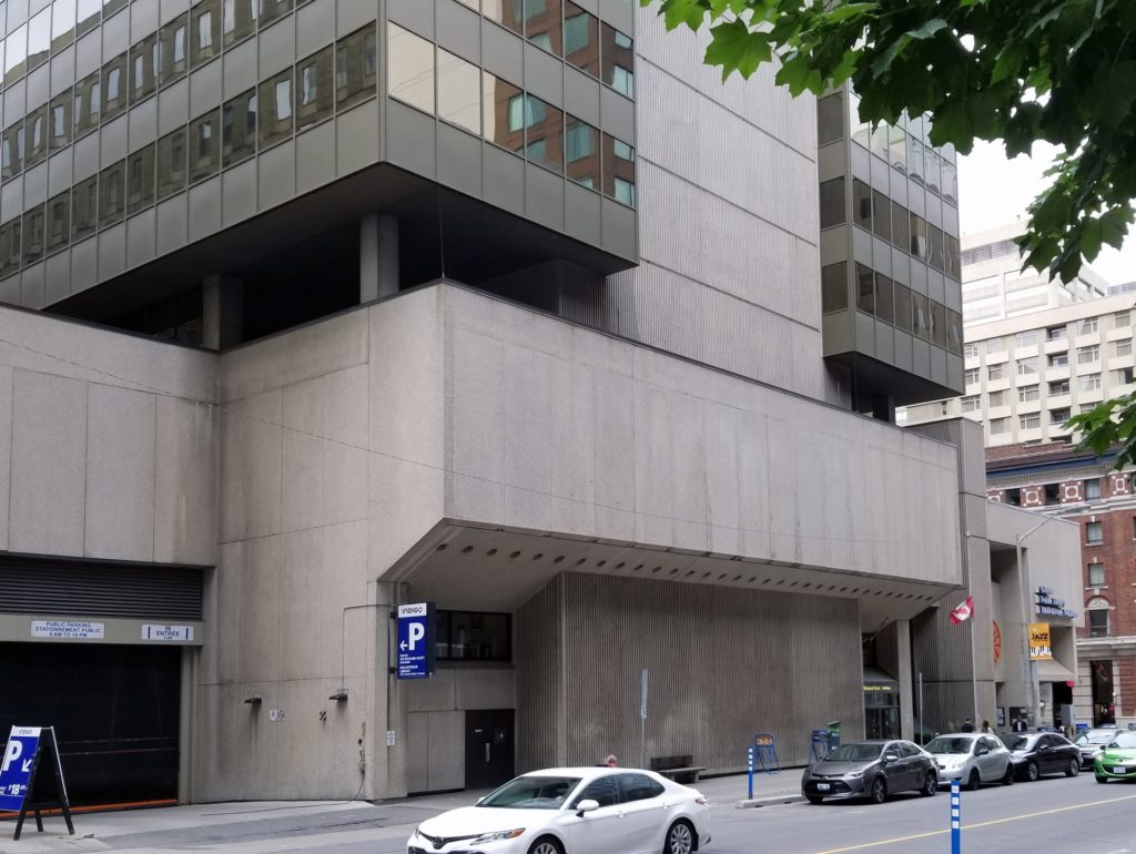
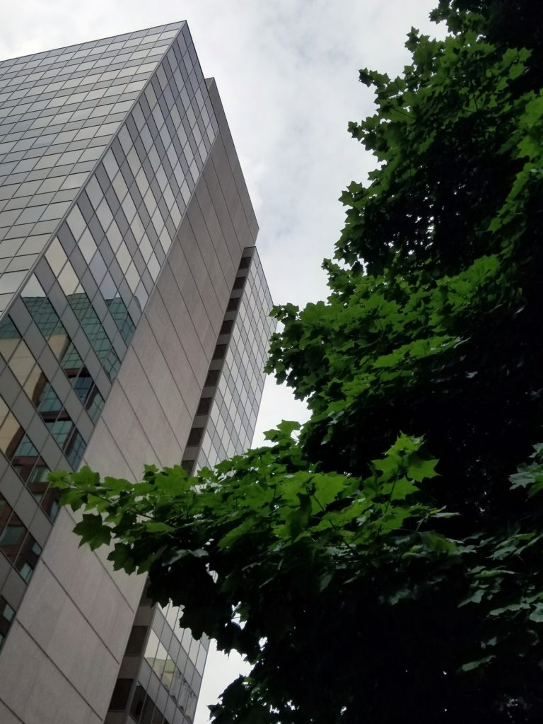

J. Kenneth Mews says
The trouble with Brutalism is not that it is bad design–it often looks great as a model or in a photograph–but that it is out of scale and repellent to human beings. It makes me feel like an ant. It reminds me of the monumental architecture of Ledoux in post-revolutionary France. Too big to build and too uncomfortable to live or work in.
Claude Jobin says
Does this comment apply more to the NAC or the Library entrance as opposed to the Royal Trust Building or the Varette Building and such which strikes me more as a play of texture in the facade?